Abolish Distraction
In an industry built around the fight for attention, it’s time to switch up our arsenal.
With the average attention span at 8.25 seconds, infamously lower than that of a goldfish, how do we provide an experience that gets users what they want, when they want it? Instead of barraging users with more information than they may need, we should provide clear direction to lead them along the right path.
The inbox is a battlefield
Take a typical promotional email for a new product. A marketer’s instinct might tell them to fill the email with product features, videos, images and other content that should compel the user to buy.
But users don’t care. People spend an average of 15 to 20 seconds reading an email — and for most reading is actually skimming.
While we can’t always know what users want, we can present our sales pitches and content in a way that doesn’t paralyze.
- Keep the content concise and focused
- Provide one primary call-to-action
- Make the call-to-action a prominent button
- Create easily skimmable chunks of content
- Make the content accessible and readable from any device
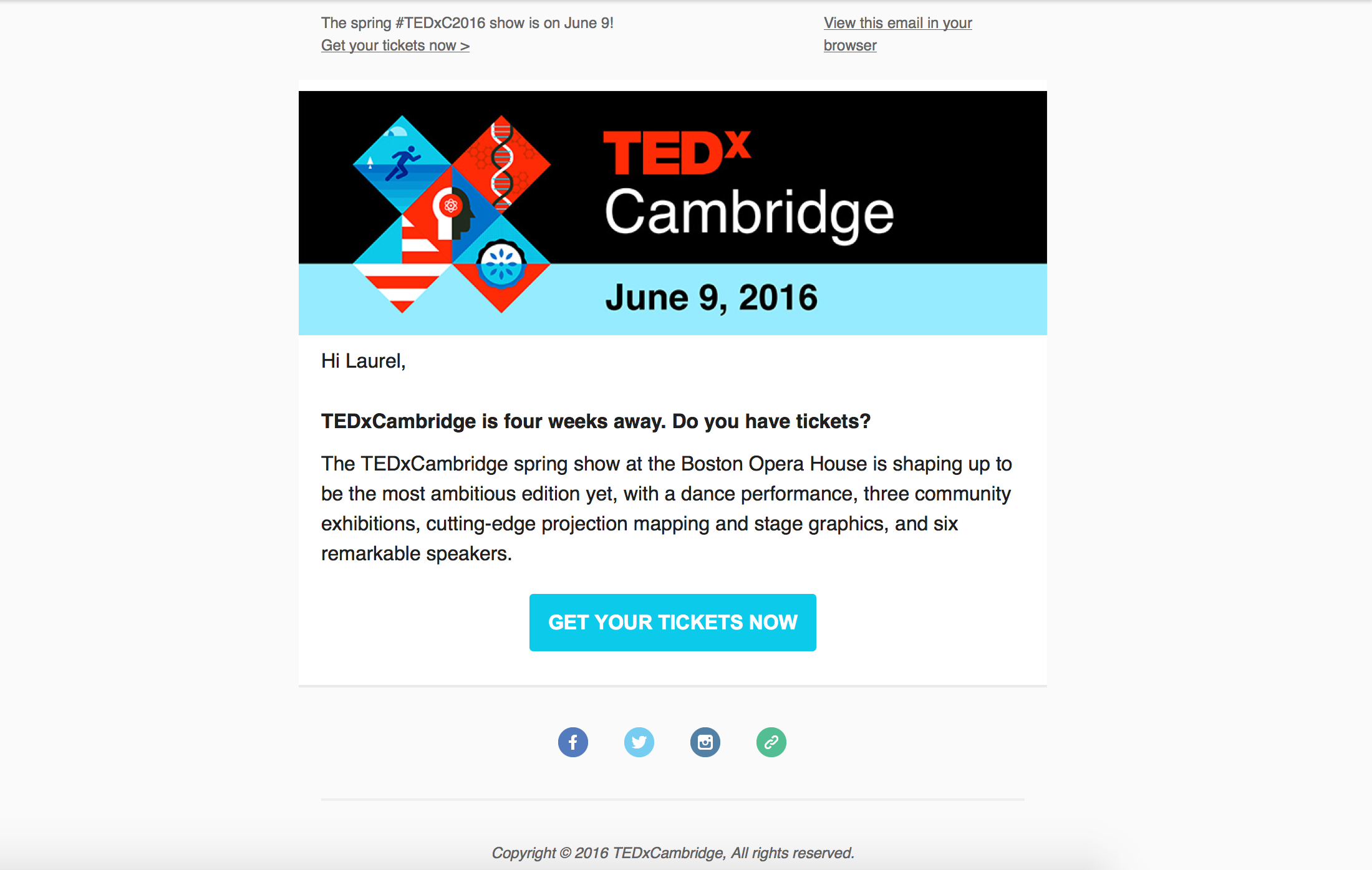
Take this email from TEDxCambridge for example. The message gets right to the point with supporting copy that adds value for the user. The action to take has a clear path with a prominent call-to-action button.
Organizing the frontlines
Naturally, a website seems like the place to dump all the information any customer might need. And while that may be so, we should be mindful in how we write and present that content.
Not everyone comes to your website for the same reason, or lands there in the same way. And with attention spans gone to the guppies, users often leave a site in 10 to 20 seconds if they can’t find what they’re looking for.
Here’s how we strive to provide a clear path:
- Only include core tasks in the navigation
- Present the most relevant information first
- Keep copy short and digestible
- Use iconography and imagery that adds value
- Tailor messaging to the goal of each page
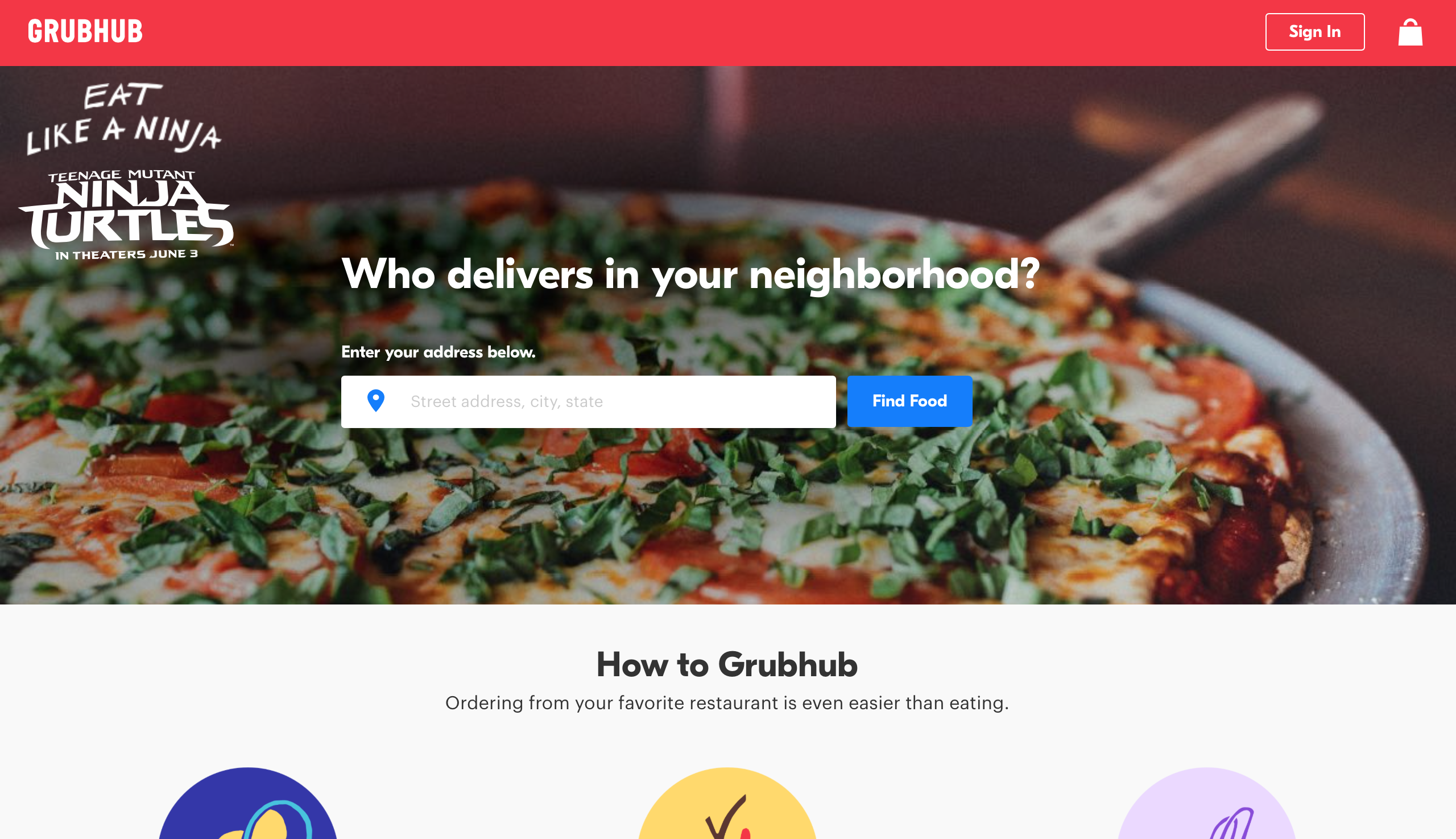
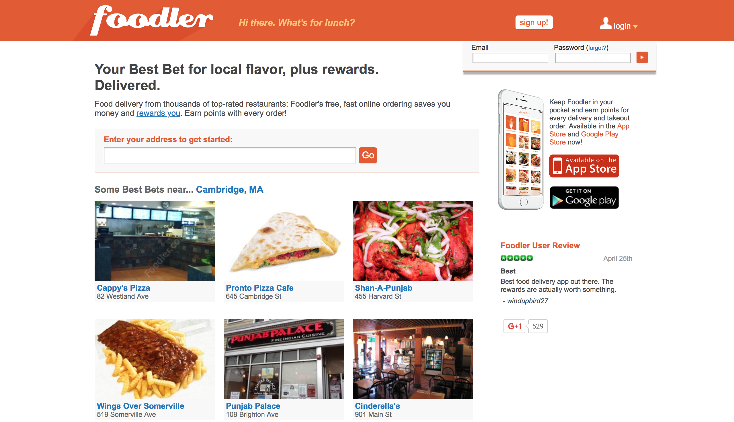
Compare GrubHub and Foodler’s interfaces. Grubhub prompts users to fill in their address before showcasing any (delicious) distractions. While Foodler presents restaurants, photos, reviews, app downloads and many other click-throughs that may distract from the task at hand.
At the end of the day we’re human. We can present the clearest path to take or the right information in exactly the right way — but there will always be something else begging for our attention.